Symphony on the Hill
Eagan, Mn
A 1980’s Eagan home needed a significant facelift, including a complete gut and rework of the kitchen.
The space was not only outdated and in disrepair, but was functioning in an extremely poor fashion for the retired owners. Our client, whom we affectionately nicknamed “The Mad Chef” had dreamt of her ideal kitchen for some time and was keen to dial in every detail. Her love language is food - made from scratch, up to your elbows, large scale meals for family and friends. She wanted to a beautiful residential kitchen to function like a commercial setup, setting the bar high for customization and material fortitude.
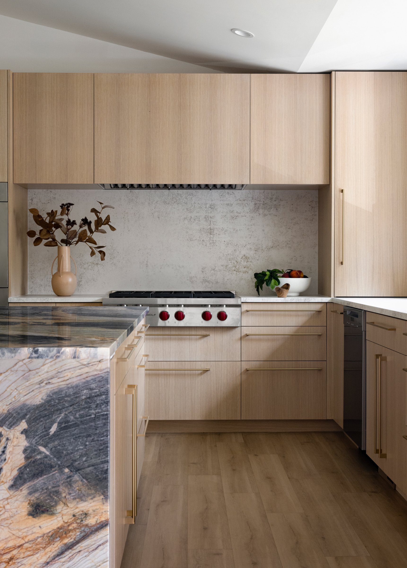
The top priority was to rework the layout, which included opening the existing kitchen to integrate with the main entry of the home, as well as the living room. Storage was a primary concern of the client, having dealt with a severe lack of it for so long. Each item was inventoried, measured (even basic utensils), and assigned a home in the new layout. We workshopped how she envisioned using the space: how would she move between appliances, which drawers would she access in what sequence, what were current pain points we needed to avoid. Each cabinet has a custom insert, some of which are even further customizable for flexible future use. Performance of the cabinetry was also analyzed, knowing that a lighter tone was wanted to create a calming and serene environment. The rift cut white oak has an extra layer of sealer to protect the finish from oils, acids and pigments.
When cooking is a family affair, a kitchen needs to rise to the occasion. We needed to plan for more than one person and multiple workstations. Wide work aisles allow the use of multiple appliances or workstations simultaneously. Access to adequate power sources was an issue we addressed by including pop-out outlets on the perimeter, as well as a plug strip on each end of the island.
Materials needed to not only hold up to typical kitchen activities, but our client wanted to be able to do things like take a boiling pot of water and slide it right onto the countertop. A commercial-grade cooktop from Wolf was going to get a workout and the countertop needed to meet the demand. Dekton was chosen for the perimeter including a full backsplash behind the cooktop; that height was mirrored on the adjacent perimeter backsplash, allowing for additional protection and visual continuity. Ease of maintenance was also key, both in meal prep and general clean-ability.
Quartzite met the performance standard needed for the island top while also becoming the shining star anchoring the material palette. Hand blown, smoked glass pendants add visual weight to light and airy space of all white walls and vaulted ceiling, a nod to the richness of the stone.
The resulting design has become the favorite part of a this multi-level remodel - our clients tells us that they can’t get guests to leave the kitchen.